Building a website looks simple: pick a template, put the copy in, publish. A site that brings in clients takes more. The design has to build trust, the copy has to persuade and Google has to be able to find you, otherwise nobody comes by. In this guide you can read how visitors judge a site, what a website costs and which choices make the difference, whether you build the site yourself or have it built.
Start with the goal of your website
A brief I get regularly: “I want a nice, modern website.” Fine. But nice for whom? And what should that website deliver?
A website for a plumber in Rotterdam has a completely different goal than a portfolio for a photographer or an online store with 500 products. The plumber wants his phone to ring. The photographer wants to make an impression. The store wants you to check out. With a B2B website it is something else again, because rarely does one person decide there and the site has to persuade a whole purchasing process. Each of those goals calls for different choices in design, structure and content.
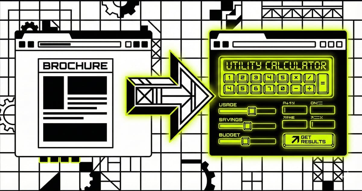
Still, many websites are built as if they all have to do the same thing: show information. A homepage, an “about us”, a contact page. Fine in itself, but a website that has to bring in clients takes more than a digital brochure.
The first question for every website:
What should a visitor do after they have been on your site? Call? Fill in a form? Buy a product? If you can't answer that question clearly, there is no point yet in thinking about colors and fonts.
Visitors judge in 50 milliseconds
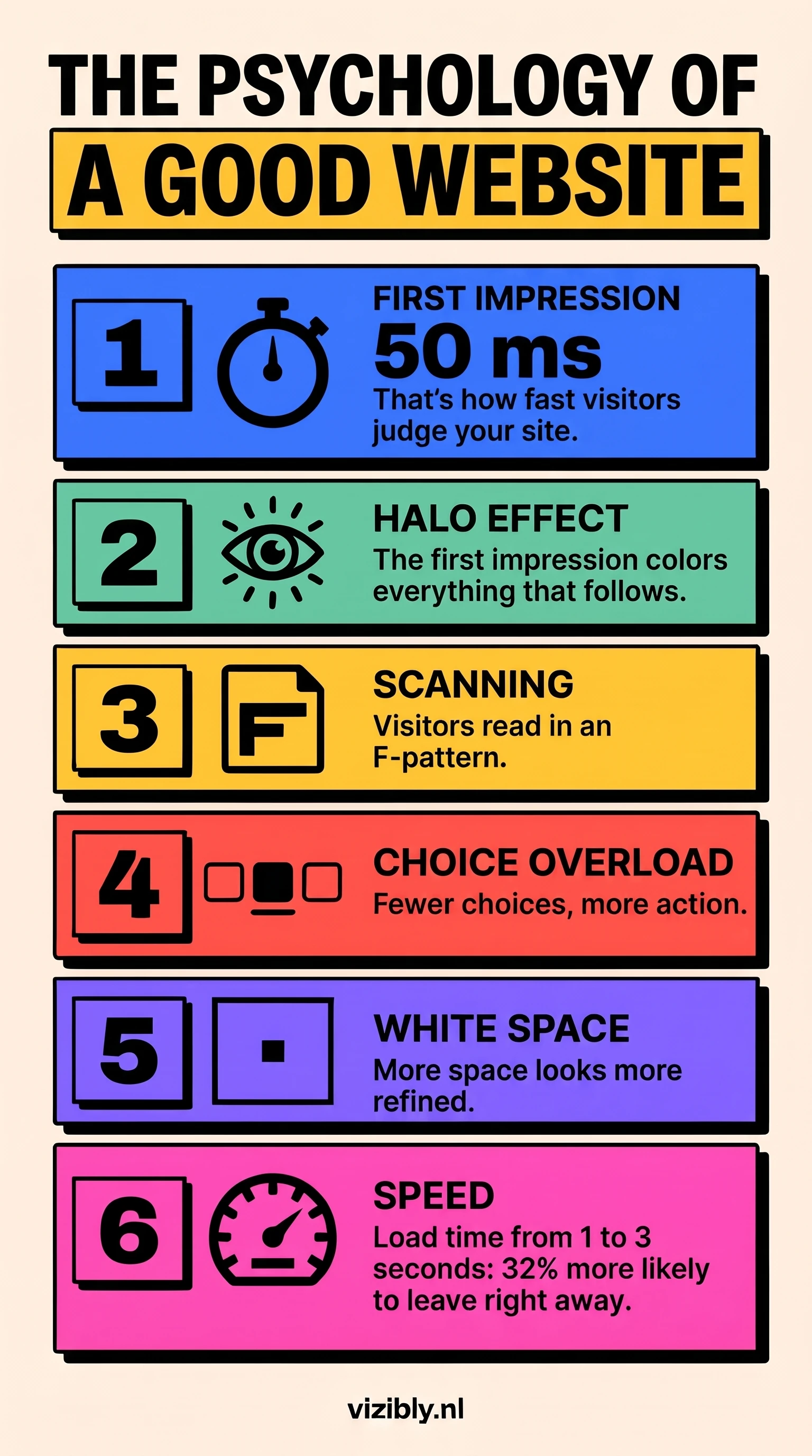
Visitors form an opinion of your website in about 50 milliseconds. That came out of research by Carleton University in Canada in 2006: participants who saw a homepage for only 50 milliseconds rated it almost the same as people who looked at it longer. That is faster than an eye blink, and in that time someone decides whether your site looks trustworthy. In the credibility research from Stanford University as well, almost half of all comments from participants were about the design: layout, fonts, colors. No other point was mentioned as often.
Compare it with a physical store. Do you walk past a messy window with yellowed posters and a broken sign? Then you keep walking, even if that store sells exactly what you are looking for. On a messy website it works the same way.
In psychology this is called the halo effect: a positive first impression colors how you judge everything else. Is the design professional? Then the visitor automatically assumes the service is professional too. Is the site messy? Then trust in your whole business drops, before anyone has read a word.
In that first flash, the overall picture matters most: the visual balance of the page (calm or chaotic), the use of color (does it go together) and the amount of white space. White space is often what people think about least, even though it says a lot. Researchers who wrote in the Journal of Consumer Research about white space in advertising found that both consumers and advertisers link a lot of empty space to refined taste and a higher price tier.
Look at the websites of premium brands: lots of breathing room, little text, large images. That is a deliberate choice, and an installation company can use the same approach just as well as a fashion house.
How design steers your visitor
A handful of psychological principles largely determine how people scan a website, what they remember and when they take action. Once you know those principles, you can take them into account in the design.
How people read your page (the F-pattern)
Eye-tracking research with hundreds of users shows that people don't read web pages the way they read a book. They scan in an F shape: first horizontally across the top, then a bit lower down horizontally once more, and then vertically down the left side of the page. The bottom right of your page is hardly seen.
For your site this means: your most important message belongs at the top left, and your headings have to be scannable, because those are what people pick up first. Long blocks of text without subheadings get skipped. On landing pages with little text, the pattern shifts to a Z shape: from top left to top right, diagonally to bottom left and then to bottom right. That last point is the logical place for your call-to-action.
Too many choices slow your visitor down
Hick's Law is one of the most practical principles in web design. It comes down to this: the more choices you give a visitor, the longer they take to decide. And the longer someone hesitates, the greater the chance they drop off without doing anything.
You see this daily on websites that want too much: five buttons in the hero, a navigation with twelve items, three different contact forms. The intention is good, because you want to give people options. The effect is choice overload. Forms work the same way: every extra field is an extra hurdle, so a short form usually brings in more inquiries than a long one.
Your visitor remembers what stands out
The Von Restorff effect means that from a series of similar things, you mainly remember the element that stands out. This principle is applied everywhere, consciously or not. On a pricing page with three plans, the middle plan often gets a different color and a label like “Most popular”. By isolating that plan visually, you steer attention toward it.
The same goes for the button of your call-to-action. The color of that button matters less than the contrast with its surroundings. An orange button on a white page stands out, the same orange button on an orange page disappears.
Where your call-to-action belongs
You often hear that buttons should be “above the fold”, so visible without scrolling. That is true for your most important button, because the top part of a page gets looked at the most. People who scroll further often read with more attention and are genuinely interested. So put your primary call-to-action above the fold, and repeat your action button lower on the page, so a reader who keeps going doesn't have to go back to the top.
Copy that persuades visitors
It happens often: a clean design, technically in good order, and then at the top three paragraphs of “Welcome to our website”, followed by jargon that only the owner understands. The design does its job, and still the visitor drops off at the copy. Design and copy have to work together.
Good web copy is scannable: short paragraphs, clear subheadings, visual structure. It addresses the reader directly, with “you” instead of “one” or “our clients”. And it is specific. “We deliver quality” is something anyone can say, “90+ PageSpeed score, live in 3 weeks” is something a client can check.
Among Dutch readers, big promises and superlatives quickly raise distrust: with “The best website in the Netherlands!” you convince no one. Write the way you talk. If you wouldn't say something to a client on the phone, don't put it on your website either.
REMEMBER: the design decides whether someone keeps looking. Whether that visitor then gets in touch depends mostly on your copy.
Typography also determines how trustworthy a site looks. Serif fonts (with serifs, think Times New Roman) convey reliability and tradition. Sans-serif fonts (without serifs, think Arial or Inter) suit modern, innovative brands better. For body text on mobile, 16 pixels is a good lower limit: smaller leads to squinting and dropping off.
What does a website cost?
What a website costs depends on what you need, who builds it and what you want to achieve with it. Below is a compact overview per tier. You can read more details, the ongoing costs and a comparison between a freelancer and an agency in the full article on website costs.
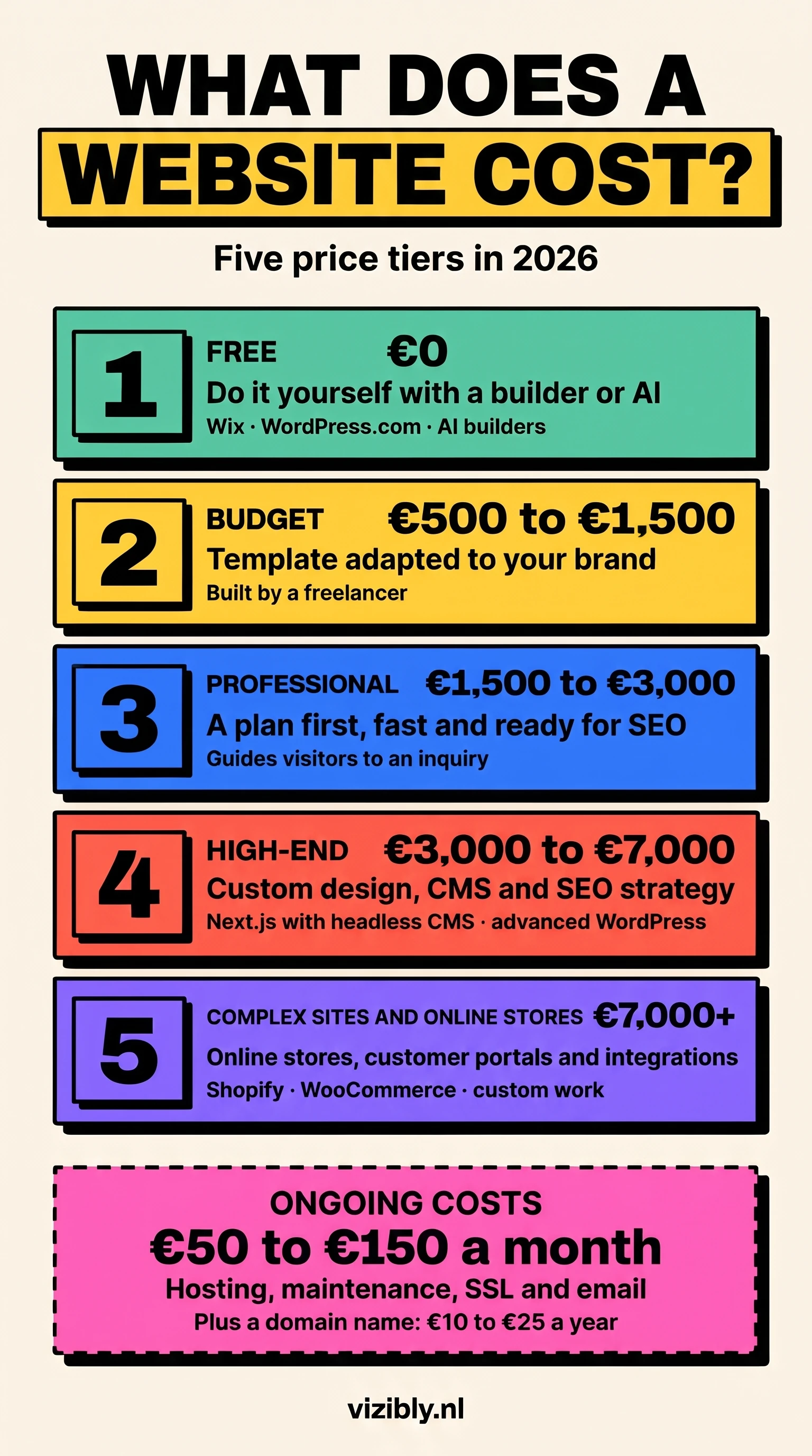
Free: do it yourself with AI or a free builder
With AI tools like Bolt, Lovable or ChatGPT you can now put together a working website in an hour. Free versions of Wix or WordPress.com are another option. You pay nothing, but you also get little: a subdomain (yourbusiness.wixsite.com), limited design choices and no control over SEO or speed. Fine for testing an idea or for a personal project. As a serious marketing tool it falls short. More on this in the article on building websites with AI.
Budget: €500 to €1,500
A freelancer who adapts an existing template to your visual identity. You get your own domain, a neat design and a simple contact form. The limitations are mostly in depth: standard SEO settings, limited load speed and little room for custom work. Quality varies a lot in this segment, so always look at earlier work. Typical stacks: WordPress with a premium theme, or a paid Wix or Squarespace subscription with support. For a self-employed person who mainly wants to be visible online, this can work fine.
Professional: €1,500 to €3,000
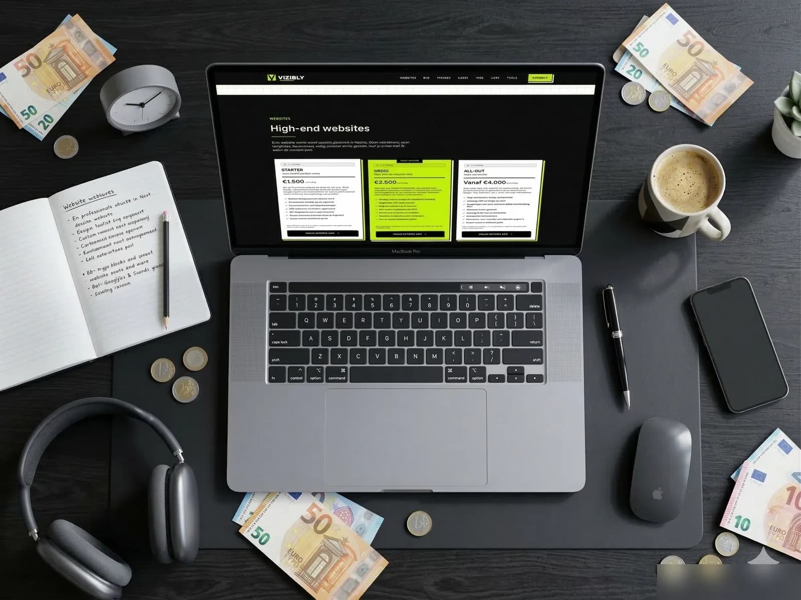
From this level you get a custom design that fits your brand, technology tuned for speed and SEO, and a clear structure that leads visitors to contact. Your website is built from a plan instead of a template. Typical stacks: WordPress with a custom theme, or a modern framework like Next.js. For most small and mid-sized businesses this is the level that serves them best. At Vizibly, websites start from €2,000.
High-end: €3,000 to €7,000
Fully custom design and development, an extensive SEO strategy, a CMS for content management, and integrations with your existing tools (analytics, CRM, email). At this level the website becomes a full marketing tool. Typical stacks: Next.js with a headless CMS (Sanity, Contentful), or an advanced WordPress setup with custom plugins. Including things like structured data, performance optimization and accessibility.
Custom and online stores: €7,000+
Complex applications, online stores with hundreds of products, portals with login functionality, or integrations with external systems. The price rises with complexity, not with the number of pages. Typical stacks: Shopify Plus, WooCommerce with custom work, or a fully headless commerce solution (Medusa, Saleor) with Next.js as the frontend. The money then mostly goes to architecture and scalability.
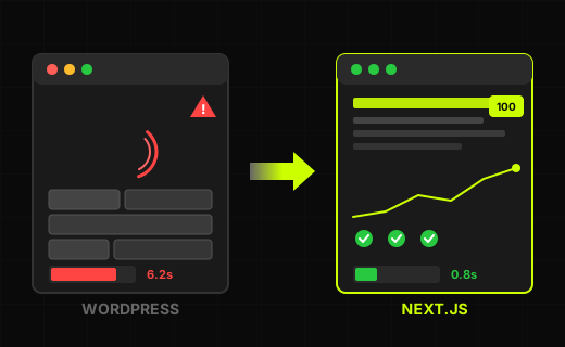
Don't forget the ongoing costs. Hosting, maintenance, SSL, updates. With a WordPress site they add up through plugin updates and security patches. With modern custom work the costs are lower because there are fewer moving parts. Plan on €30 to €100 a month for hosting and maintenance.
Always put the price next to what a website delivers. A €2,500 website that brings in five new clients a month is cheaper than a free website that brings in none. Many business owners cut back on their website and then spend thousands of euros on Google Ads to make up for the lack of organic traffic.
The technology under your website
A website can look perfect and still fail if the technology isn't right. Google judges your site on three measurable points, the Core Web Vitals: how fast the largest piece of content loads, how fast the page responds to a click, and how stable the layout is while loading.
Speed helps decide whether a visitor stays. Google looked into this for mobile sites: when the load time goes from 1 to 3 seconds, the chance that a visitor leaves right away goes up by 32%. Want to know how your site performs? Test it with the website speed test.
A few technical elements also decide whether Google can read your site well: a clean sitemap, correct canonical tags, structured data and a logical URL structure. As a visitor you see none of it. Google does read them, and uses them to understand your pages. You can read more about this in the article on technical SEO.
Accessibility is part of that technical foundation too. The European Accessibility Act requires more and more websites to follow WCAG guidelines; what that involves, you can read below under the common mistakes. For privacy something similar applies: the GDPR calls for a clear cookie policy and a privacy statement, and that too should be built into your site from the start.
SEO is part of building your website
A beautiful website helps little if nobody finds it. For most business websites, search engines are the most important source of new visitors. AI search engines are on the rise, but most people still simply search through Google.
SEO (search engine optimization) lives in the way you build a website: the structure of your pages, the copy on them, the speed at which they load and how pages link to each other. Putting something “on top of” your site afterward therefore only works to a limited extent. If that foundation isn't in order, investing in content or link building makes little sense.
The three layers of SEO
SEO touches your whole site, including the keywords in your page titles and the structure of your URLs. A website that is technically well put together, loads fast and has the right content for your audience has a better chance in Google. That goes both for local businesses that want clients from the region and for online stores that want to rank nationally.
In practice it comes down to three layers. Technical SEO: how well can Google crawl and index your site? Think of a clean sitemap, correct canonical tags, structured data and fast load times. Then content: do you write about the topics your audience searches for? And finally authority: do other sites link to your content? The more relevant links, the higher Google rates you. You can read more about those three layers in the complete guide to SEO.
Local findability
For most small and mid-sized businesses, local SEO is the starting point. Your Google Business Profile, reviews and local search terms decide whether you are at the top when someone in your area searches. A plumber in Utrecht doesn't compete with a plumber in Maastricht. That local focus is exactly what makes it feasible to rank high, even against bigger players.
The advantage of having website and SEO with the same party: whoever does the analysis also adjusts the site. A technical SEO problem can then be fixed right away, without first sitting in another agency's ticket queue.
Seven common website mistakes
1. No clear call-to-action
A visitor reads your page, is interested and then looks for a next step, which isn't there: no button, form or phone number. Six buttons that all ask for something different work just as badly. Give every page one clear action.
2. Mobile as an afterthought
A large share of your visitors comes in on a phone. If your website doesn't work well there, those visitors drop off before they get in touch. So design mobile-first: for the small screen first, then for desktop.
3. No analytics
Without measurement you don't know whether your website works. Google Search Console (free) shows which keywords you are found on, and Google Analytics shows what visitors do on your site. With those two you can see which pages do well and which need attention.
4. Too much text on the homepage
On your homepage, show what you do, for whom, and why someone should keep looking. The details belong on subpages. If your homepage tries to say everything at once, the visitor loses sight of the main point.
5. No trust signals
Visitors don't simply trust what a company says about itself. Reviews, client stories, a Chamber of Commerce (KvK) number and a clear address do help. Dutch visitors look at different signals than American ones: Thuiswinkel Waarborg (a Dutch trust mark for online stores) is well known and Google reviews are trusted, while “As seen on TV” badges make little impression. So choose trust signals that fit the Dutch market. And be open about costs, because costs that only show up at checkout are a well-known reason to drop off.
6. Ignoring accessibility
Since the European Accessibility Act, more and more websites have to meet WCAG guidelines. That means: usable with a screen reader, navigable with the keyboard, enough color contrast, and alt text on images. Many business owners think this only applies to government sites, but the law is getting broader. And apart from the law: good contrast also helps someone looking at a phone in bright sunlight, and a site that works with the keyboard also helps someone with a broken arm. Test it with the accessibility checker.
7. “My nephew can do that too”
Everyone knows someone who “also makes websites”, and sometimes that is fine. A professional website takes more than installing a template, though: knowledge of SEO, conversion optimization, accessibility, security and speed. If your website has to bring in clients, weigh your nephew's friends-and-family price against the clients you gain from having a specialist build your website.
Frequently asked questions about building a website
How long does it take to have a website built?
A compact business website is live in 2 to 3 weeks. A more extensive site with a blog, a CMS and extra functionality takes 4 to 8 weeks. The turnaround depends mostly on how fast content and feedback come in.
Can I build a website myself?
Yes, with tools like Wix or Squarespace you can build a website yourself. You are limited in design, speed and SEO, though. For a professional website that brings in clients, it pays to bring in a specialist. You can read more about the trade-off in the article on building websites with AI.
How much does it cost to have a website built?
That depends on the functionality you need. A professional website costs between €1,500 and €3,000. High-end custom work with SEO and a CMS runs between €3,000 and €7,000. Online stores and complex applications cost €7,000 or more. See the pricing page for a full overview.
Do I need a CMS?
That depends on how often your content changes. If you publish a blog post every week, a CMS (a system you use to edit copy yourself) is handy. If your content rarely changes, a CMS is mostly an extra cost and a possible security risk. Many business websites don't need a CMS.
What if I already have a website?
First check whether that site brings in clients. If it doesn't, a redesign or a move to a faster platform may be worth it. Test your current site with the website checker to see where you stand.
See how your website scores right now
The test is free and shows what could be better on your site. Or get in touch if you would rather talk about it first.
CHECK YOUR WEBSITE