Design experiment · Enamel
Website for a bike shop
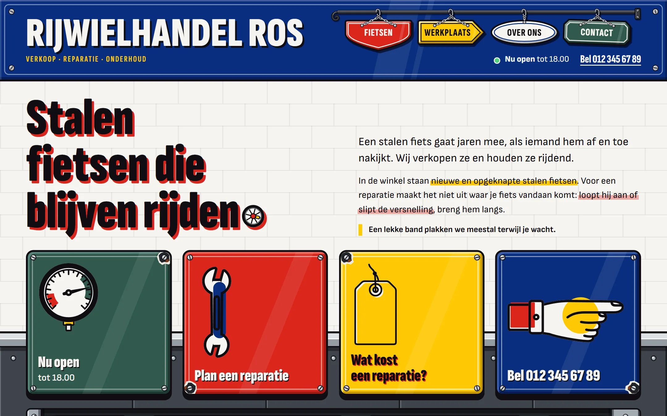
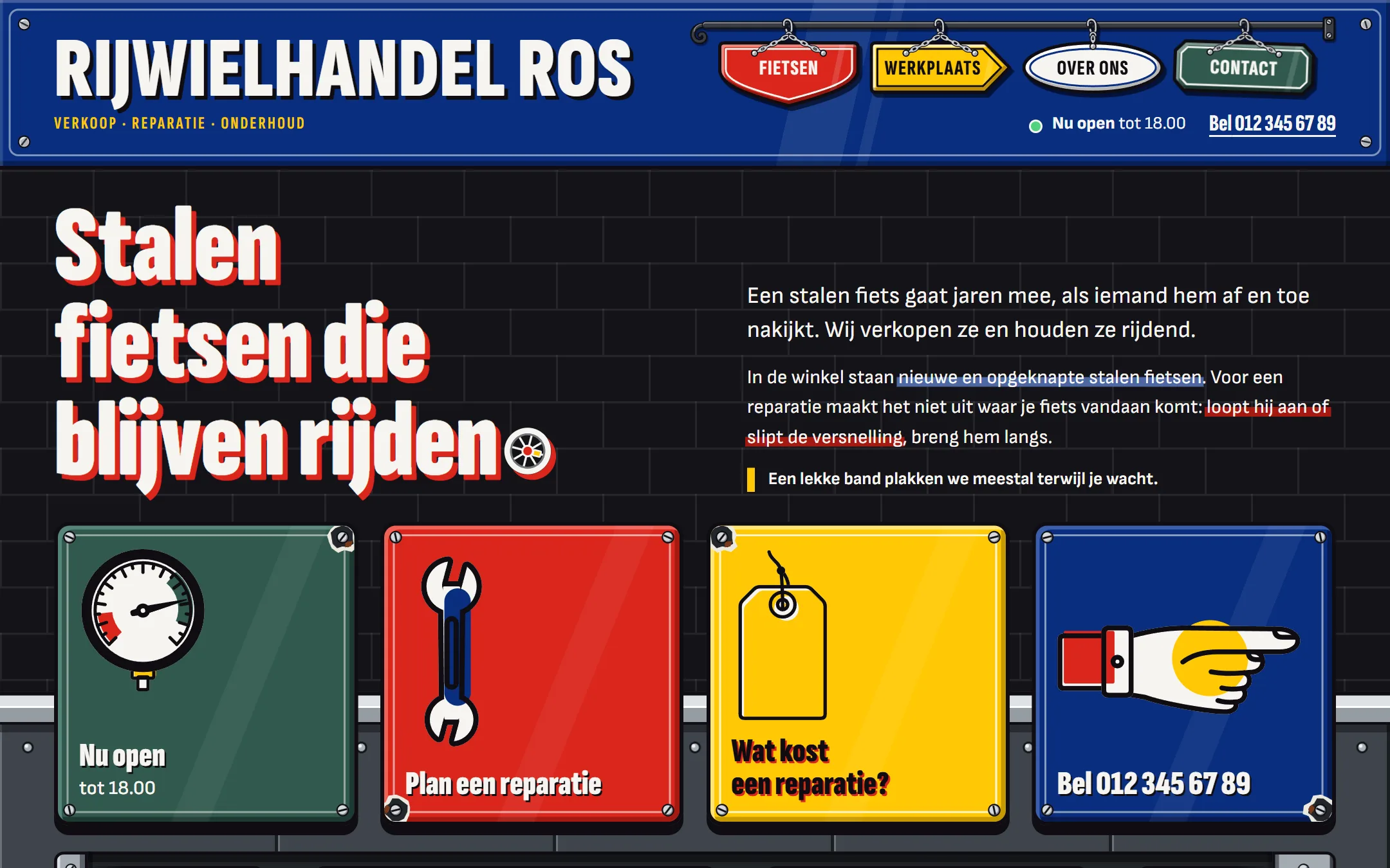
Rijwielhandel Ros doesn't exist. It's a bike shop I made up to try out a style: a website that looks like old enamel advertising signs, with bright colors and heavy lettering.
THE EXPERIMENT
A bike shop to experiment with
I enjoy experimenting with design. For this one, I gave the bike shop a storefront and a workshop on a street corner, and built the site a business like that could have. After eight versions, this is where it ended up.
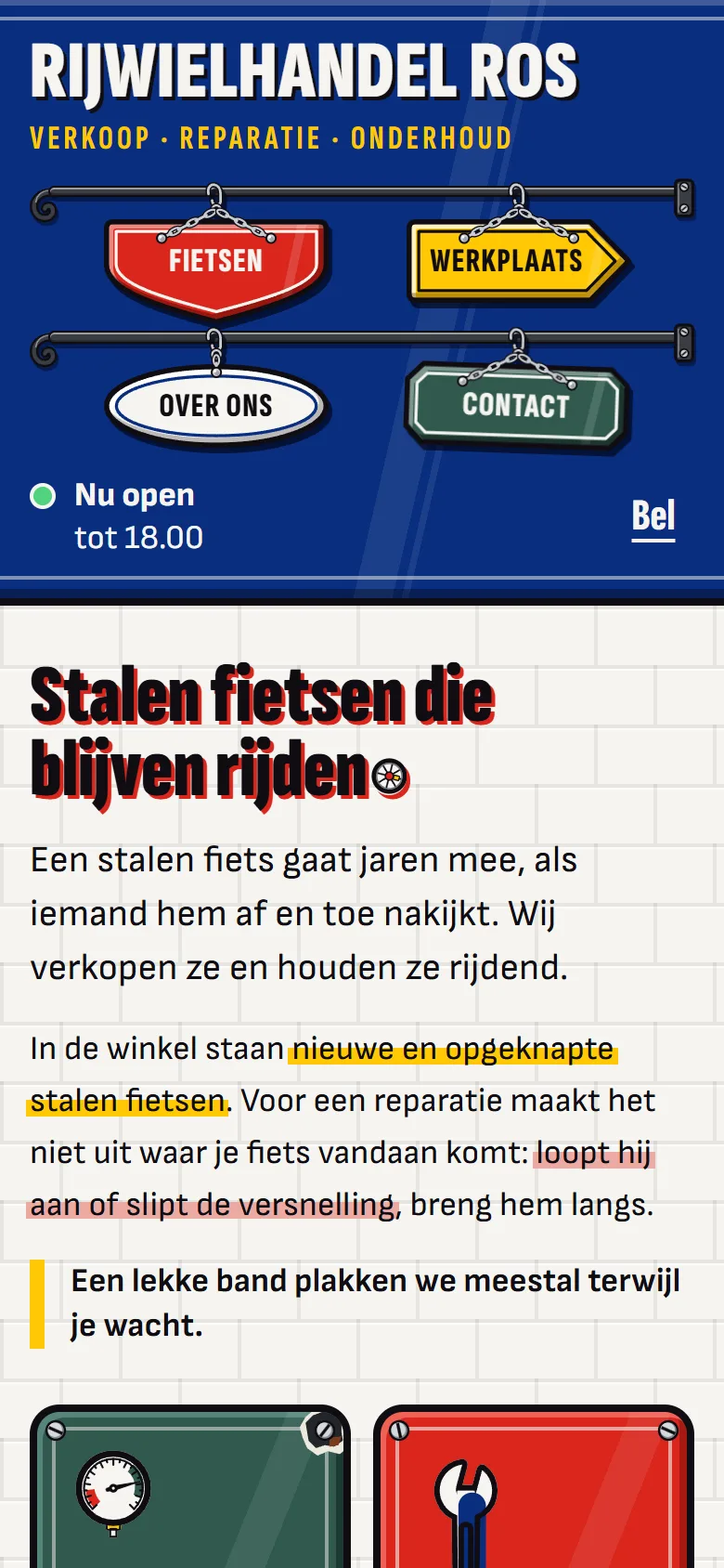
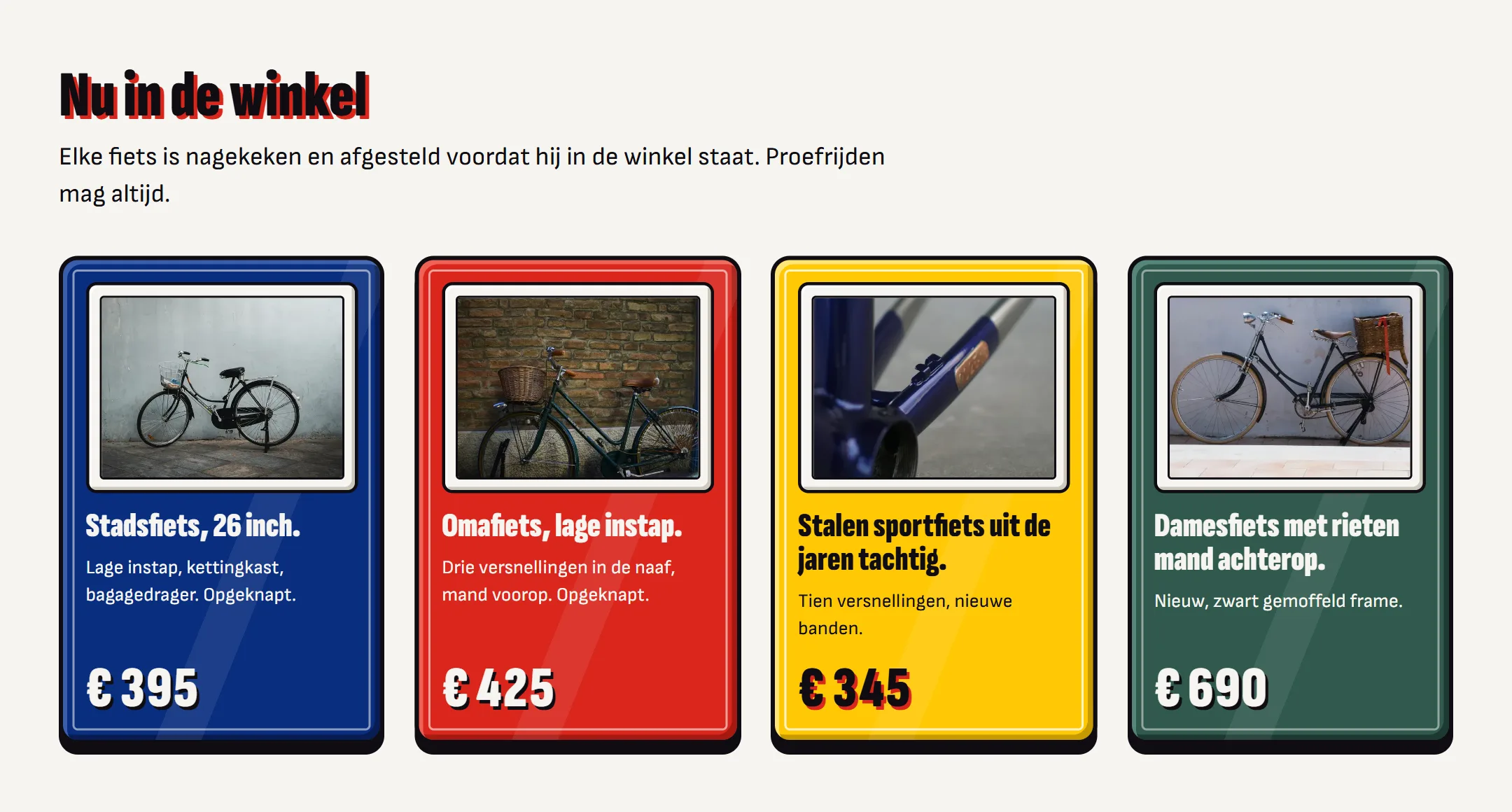
Every sign has little screws in the corners and a sheen across the enamel, and the colors and black lines are borrowed from the painter Fernand Léger. The menu is a row of shop signs hanging from a rod, and the row swings for a moment when you hover over a sign.
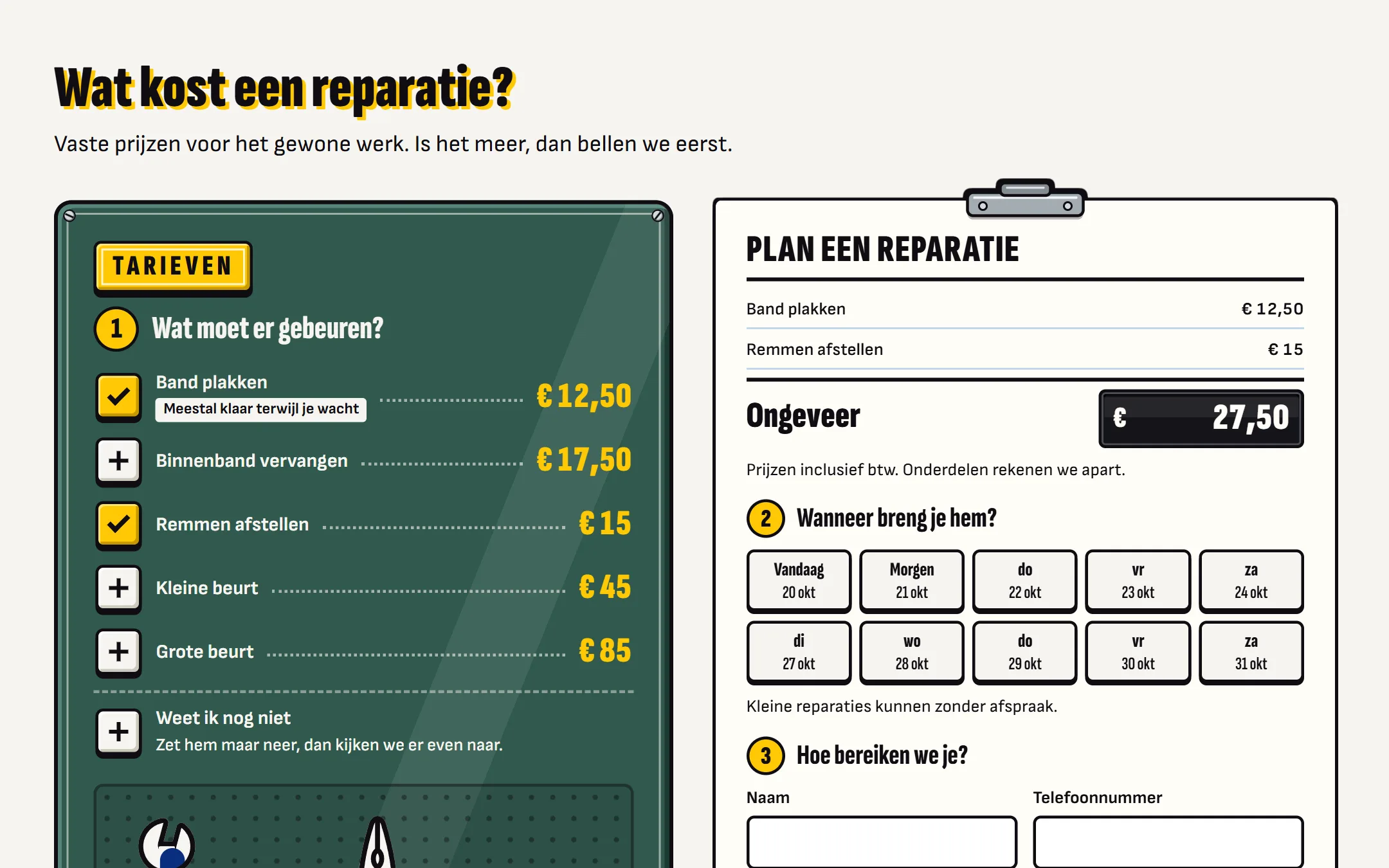
The site shows whether the shop is open and works out what a repair costs. You can even pick a day to drop off your bike, though that request never arrives anywhere: the shop doesn't exist.
IN PICTURES
A few screens from the site
More case studies
All case studies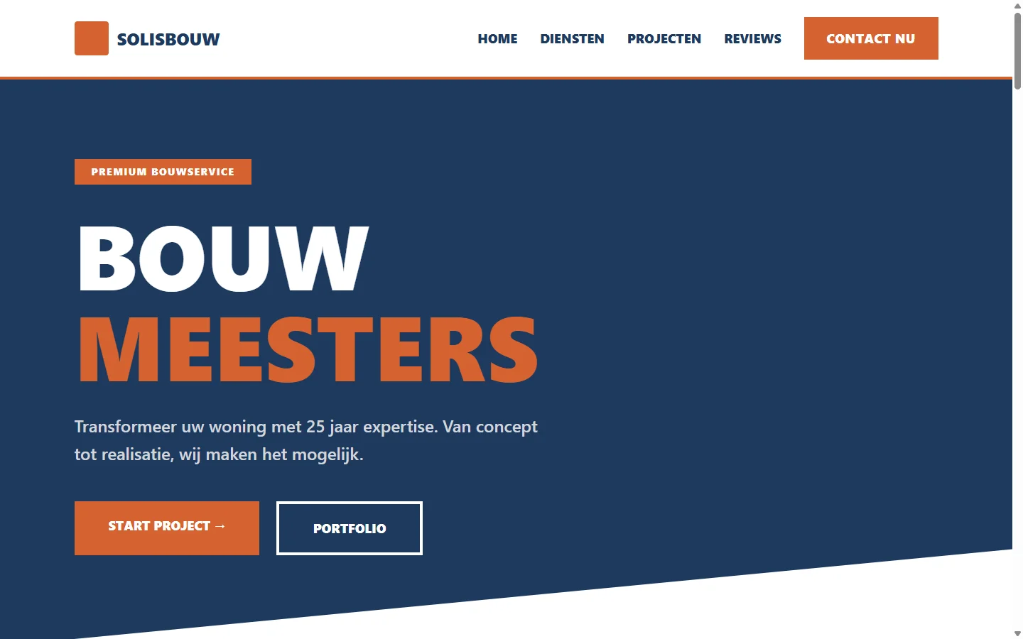 WEBSITE
Construction company
A high-end website for a renovation company with 25 years of experience: a diagonal opening section and a portfolio of projects.
VIEW CASE STUDY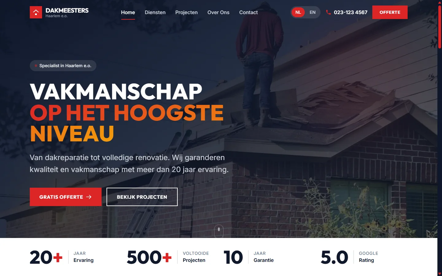 WEBSITE
Roofing company
A website for a roofing company with more than 20 years of experience: a bold design with glass effects, in Dutch and English.
VIEW CASE STUDY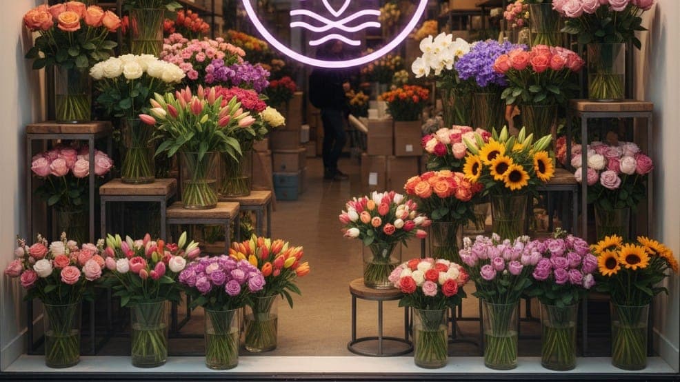 SEO
Ecommerce
+1,500%Revenue
In two years, an online florist grew from 1,700 to 10,000 organic visitors a month, and revenue rose by 1,500%.
VIEW CASE STUDYWant a website with a style of its own?
I design and build the site myself, in a style that suits your business and with a structure that's easy for Google to read.